Android's dialpad dilemma: Stylish leap or just needless tweak?
Android's dialpad dilemma: Stylish leap or just needless tweak?
The morning started like any other. My alarm went on and it was six past ten. I was late! I hurriedly reached for my phone (my daily morning ritual) to call my friend to halt the bus for a while. While getting dressed up I focused that the familiar screen looked different. My trusty dialpad, the one I had tapped a thousand times, had mutated overnight. Rounded buttons, neat cards, swipe-to-answer, and my old interface were gone!
I blinked. Did someone hack my phone? Was this a glitch? A moment of panic later, I discovered the truth: Google’s Phone App, version 186, featuring Material You 3 Expressive. My old, dependable dialpad had been reimagined while I slept.
For anyone who treats their smartphone as an extension of themselves, this is no small change. Colours, shapes, and layouts have been reconsidered. Buttons no longer float; rather, they blend into a built-in keypad.
Starred contacts rise to the top of the home screen, while recent calls unfold below in neat, card-like precision. Depending on your tolerance for novelty, this update can feel thrilling or disconcerting.
The details that matter
The home screen
The old separation of Favorites and Recents is gone. One screen now serves as a stage for your most important connections. Quick glance, instant clarity: everything you need is right there.
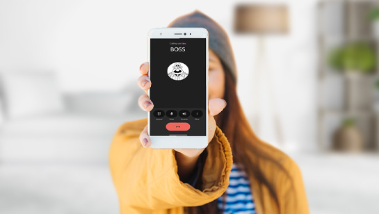
The dialing screen
Floating call buttons? It may soon cease to exist as the new keypad is integrated, rounded, and inviting, ensuring a tactile promise that dialing is now smooth and almost instinctive.
Swipe, tap, accept or decline
Incoming calls now come with a little choreography. Swipe sideways to accept or reject, which are small and decisive gestures. Prefer the old-school method? You can toggle it off in settings.
Dual SIM, with caveats
The app shows which SIM is being used for a call, but it might not be very obvious to everyone. Even a well-designed interface can be a little tricky for human instincts to follow perfectly.
The call buttons
The call buttons are now pill-shaped, and the end-call button is big and bold so that there’s no way you’ll miss it. Everything is designed to be clear and easy to use.
Reclaiming the familiar
For the brave souls who pine for the good old days of perfectly predictable buttons and comforting layouts, fear not: Google generously allows a return. Yes, you can peel back the layers of “progress” and reclaim the interface you actually understand because apparently nostalgia now comes with a settings menu.
Option one: Uninstall updates
- Settings → Apps → Phone → Three-dot menu → Uninstall updates. Your classic dialpad returns instantly.
Option two: Roll back via APK
- Uninstall → Download an older, trusted APK → Reinstall. Caution: only use reputable sources.
A word to the wise:
- Disable auto-updates. Because apparently, your phone has a mind of its own and will sneak in a makeover while you’re sipping your coffee.
- Leave the beta program. Unless you enjoy living on the edge, rolling the dice every time Google decides your dialpad needs a personality transplant.
Congratulation, if you follow these sacred rituals, you might just survive the whims of modern app design with your sanity (and your classic dialpad) intact.
To update or not to update
For the curious, version 186 awaits in the Google Play Store. Material You 3 Expressive is modern, playful, and sophisticated. Whether you embrace it or roll back, one truth remains: Google’s dialpad has moved from mere function to something expressive, more of a tiny evolution you can feel with every swipe and tap.